


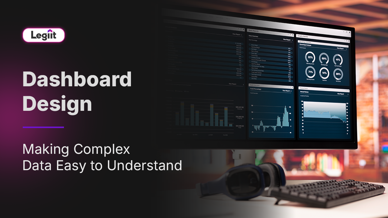
We have all been there. You log into a new software tool expecting to see how your business is doing. Instead, you are greeted by a chaotic wall of numbers. There are twelve different pie charts, a table with fifty columns, and a ticker tape scrolling across the top.
You stare at it for two minutes. You feel overwhelmed. Then you close the tab and go back to your old spreadsheet.
This is a failure of design, not data.
Most businesses have plenty of data. The problem is that they do not know how to present it. They confuse volume with value. They think that showing everything at once is transparent, but in reality, it is just noise.
Good dashboard design is not about making things look pretty. It is about cognitive science. It is about organising information so that the human brain can process it instantly and make a decision.
This guide explores the principles of effective dashboard design and how to turn a screen full of numbers into a clear, actionable story.
The Five Second Rule

The golden rule of dashboard design is simple. A user should be able to answer the most important question about their business within five seconds of the page loading.
Am I winning or losing today?
If they have to scroll, hover over a tooltip, or pull out a calculator to answer that question, the design has failed.
To achieve this, you must ruthlessly prioritise. You cannot give every metric equal weight. You must use visual hierarchy. The most critical number, usually Revenue, Profit, or Active Users, should be the largest element on the screen, placed in the top left corner where the eye naturally begins. Secondary metrics should be smaller, and supporting tables should be at the bottom.
The "So What" Factor
A number without context is useless.
Imagine a dashboard that displays a big green number: $10,000.
Is that good? Is it bad? Did we make $50,000 yesterday? Did we aim for $5,000? Without context, the user feels anxiety rather than clarity.
Great design solves this by always providing a comparison. It never just shows the current status. It shows the status relative to a benchmark.
- Bad Design: Sales: $10,000
- Good Design: Sales: $10,000 (Up 15 percent vs. Last Week)
This is where AI takes design to the next level. Instead of just showing a percentage change, an AI driven dashboard can add a narrative sentence below the metric explaining why it changed. For example: "Sales are up due to the holiday email campaign sent on Tuesday."
Choosing the Right Visuals
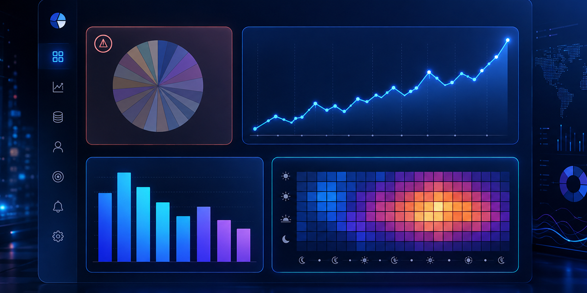
A common mistake is using flashy charts just because they look cool.
Designers often love doughnut charts and radar graphs because they look modern. Data analysts hate them because they are hard to read.
The goal of a chart is to reduce the time it takes to understand a trend.
- Pie Charts: Avoid them if you have more than three categories. It is nearly impossible for the human eye to compare the size of similar slices.
- Line Charts: Perfect for showing trends over time.
- Bar Charts: The best choice for comparing different categories (e.g., Sales by Region).
- Heat Maps: Excellent for complex data sets, like seeing which hours of the day are busiest for support tickets.
The best dashboards often look boring at first glance. They use simple bar charts and clear tables because clarity is always more valuable than decoration.
The Ink to Data Ratio
There is a famous concept in data visualisation called the Data Ink Ratio. It states that every pixel of ink (or colored pixel on a screen) should be used to show data.
Anything else is clutter.
Bad dashboards are full of "chart junk." They have heavy grid lines, 3D effects on bars, bright background colours, and decorative borders. These elements force the brain to work harder to filter out the noise to find the signal.
A professional dashboard designer strips all of this away. They use white space instead of lines to separate sections. They use soft greys instead of black for text. The result is a clean interface that feels calm, allowing the data to stand out.
Why You Need a UI Expert
It is tempting to let a backend developer build your dashboard. They know the data best, after all.
But developers think in terms of database structure. Designers think in terms of user workflow.
If you let a developer design the dashboard, you will get a screen that perfectly reflects the database table structure, which is usually confusing for a CEO. If you hire a UI specialist, you get a screen that reflects how a human actually thinks about the problem.
This brings us back to our pillar resource: The Top 10 Freelancers who build AI Analytics Dashboard for Business Intelligence. These professionals bridge the gap. They understand the complex code required to fetch the data, but they also possess the design skills to present it simply.
Final Verdict
A dashboard is only as good as the decisions it inspires.
You can have the most advanced AI algorithms in the world, but if the interface is cluttered, ugly, or confusing, your team will ignore it. Design is not an afterthought; it is the interface between your data and your brain.
Investing in clean, professional dashboard design results in faster decisions, fewer errors, and a team that actually enjoys using the tools you give them.
However, achieving this balance of form and function is a rare skill. It requires a designer who understands data. Do not settle for a default template. Head to Legiit, browse the portfolios of the AI Analytics experts, and find a freelancer who can make your complex data look simple.
FAQ: Dashboard Design
What is the most common mistake in dashboard design?
The most common mistake is "cognitive overload," or putting too much on one screen. Trying to answer every possible question on a single page results in a cluttered mess that nobody uses. It is better to have one summary page and separate pages for detailed reports.
How many metrics should be on a single dashboard?
A good rule of thumb is the "7 plus or minus 2" rule. The human working memory can only hold about seven items at once. Try to limit your key dashboard to 5 to 9 primary metrics.
Why are pie charts often discouraged?
Pie charts are poor at communicating precise comparisons. It is difficult for the human eye to judge the difference between a slice that is 25 per cent and a slice that is 30 percent. A bar chart makes this difference immediately obvious.
What is the difference between an operational and a strategic dashboard?
An Operational Dashboard is for monitoring real-time activity (e.g., Server Status, Support Ticket Queue) and requires instant action. A Strategic Dashboard is for long-term tracking (e.g., Monthly Revenue Growth) and is used for high-level decision-making.
Do I need a UX designer for a data dashboard?
Yes. A UX (User Experience) designer ensures the dashboard follows a logical flow. They make sure the most important buttons are easy to reach and that the colours used (like red and green) are accessible to color blind users.










 Download