


Search Engine Optimization (SEO) and user experience (UX) play a crucial role in building a successful website.
While effective SEO optimization ensures your website continues to rank higher in the search engine result pages, a great UI/UX ensures your visitors have a positive experience on your website and are more likely to return (read – lower bounce rate).
One of the critical components for both SEO and UX is the website’s navigation design.
A well-structured and user-friendly navigation ensures visitors can easily find what they came looking for without getting stuck. Moreover, a great navigation design also makes the crawling process for search engine crawlers more seamless.
As surprising as it may sound, marketers and website owners are so entangled with creating content, building links, running ad campaigns, and more that they forget to give due attention that the site’s navigation deserves.
And in the end, poorly structured navigation becomes a roadblock to your SEO success, no matter how well you’re watering other SEO elements.
In this article, we will dive deep into answering how to design navigation for optimal SEO, ensuring your website’s navigation acts as a compass for both users and search engines.
What Elements Make Up Navigation Design?
A user-friendly navigation design consists of various elements used by users and search engine crawlers to find specific information or products.
These elements include –
- Main Menu
- Footer
- Structured Information Architecture
- CTA (Call-To-Action) Buttons
- Content Hierarchy
- Logo
- Search Bar
- Relevant Inter-Linking (Between relevant and related blog articles, product pages, and main pages)
- Breadcrumbs
Why Is Navigation Important for Optimal SEO?
The first impression of your website’s visitors and their subsequent experience depends heavily on your website’s navigation.
User-friendly navigation ensures that users are able to browse through your website and navigate through its content effortlessly. It is important to create a navigation design that is intuitive and straightforward so users can easily move from point A to point B without struggling.
A well-defined site’s navigation structure is the key to positively influencing how the users interact with your site’s content.
The better the navigation, the superior would be your brand image, resulting in improved user experience and conversion rate or whatever goals you’ve defined for your website.
How To Design Navigation for Optimal SEO – 11 Best Practices to Follow
1# Research & Identify the Pages You Want to Create
Start with website navigation analysis to identify and understand the pages you want on your website. Because navigation is all about the great pages that users can navigate.
Create a list of pages you want on your website, ideally in a spreadsheet.
Indulge in in-depth market and industry research to understand what your audience is looking for. It will help you only create the pages your site visitors would be interested in.
Keyword research is an integral component in the research process to understand what users will be interested in.
Use keyword research tools to identify what your target audience is looking for, what your competitors are using and ranking for, and your primary/secondary keywords.
With the help of keywords, you can create a list of parent topics, topic clusters, and secondary keywords.
If you already have a website, conducting a website audit will help you identify gaps in the navigation design and room for improvement.
2# Get Started with Creating Hierarchical Website Navigation
Once you have a list of pages you want to create for your website, group those pages to create a hierarchy structure.
Start by grouping those pages into broad category pages, which can be top-level product categories, about us sections, articles, or whatever your niche demands.
Once the broad-type pages are defined, create a hierarchy of those pages further. The idea is to go deeper and more specific with these hierarchies.
For example –
Home > Watches > Women’s Watches > Chronograph Watches > Metal Chronograph Watches > Cartier Watches
Organizing content in a way that makes it easier for the user to find what they’re looking for is ideal for optimal SEO and enhanced user experience.
Looking at what competitors are doing is also a great starting point. Check how the breadcrumbs and other navigational elements are organized in large competing sites to get an idea of how to organize information.
Examining a site’s URL structure through various SEO tools is also a great way to define a clear-cut site structure.
3# Create A Sitemap
Defining the hierarchical structure of your website means building your site’s sitemap.
It showcases the hierarchical page structure your website will display. The more intuitive and research-oriented it is, the better it will be for your users and for SEO.
Sitemap helps guide the site’s navigation to segregate primary categories and subpages in a well-defined manner, helping improve user experience.
Clear & Intuitive Navigation Structure
First things first, your sitemap doesn’t have to replicate navigation. The navigation structure should only showcase the pages your visitors need.
Prioritize designing a website that’s clear, easy to navigate, and straightforward. The navigation patterns on your website should look familiar to your target audience, offering them a seamless browsing experience.
The navigation structure should also be designed to help search engine crawlers crawl through your website without getting entangled in a web of subdirectories.
However, don’t try to oversimplify, too, as it might jeopardize user experience by withholding elements necessary for users to navigate through your website, making it difficult for them to find what they’re looking for.
In essence, try to create a balanced navigation structure that doesn’t have too many or too few navigational elements.

4# Use Descriptive Labels
The navigation menu should have descriptive labels that accurately describe what the page is all about. Don’t keep complicated or quirky labels that may confuse the readers.
Visitors have short attention spans when browsing the internet and even little patience.
If visitors can’t quickly access what they’re looking for, they won’t mind shutting down the website to visit your competitor.
Unclear labels can be confusing and frustrating for visitors and most likely will lead to high bounce rates, which isn’t good for SEO optimization.
5# Choosing The Right Navigation Type
You need to be thorough, data-driven and conduct in-depth market research to understand and employ a navigation type that suits your target audience and website.
Most websites with limited content prefer the most commonly seen horizontal navigation or are static in nature. It contains sections like About Us or Contact that lead visitors quickly to what they are looking for.
However, such navigation is unsuitable for large websites, including e-commerce websites, with over 50 or 100 categories and hundreds of more sub-categories. This is why you often see large websites opting for vertical sidebar or drop-down navigation menus.
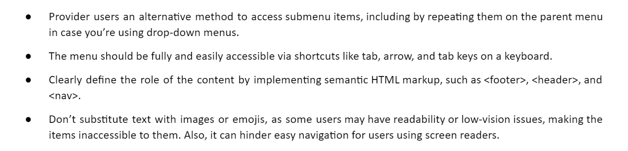
6# Improve Accessibility
Around 16 percent of the global population has a disability, and it’s important to account for it when creating user-friendly navigation.
The navigation of your website should be accessible to all your visitors.
You can enhance your website’s accessibility by –
7# Must-Have Search Bar & Call-To-Action Button in Top-Level Navigation
Having a search bar ensures your users can quickly locate what they came looking for without any hassles.
Moreover, adding a call-to-action button on top of the page guides visitors to key pages, improves clickability, and helps boost conversion rate.
8# Utilize Breadcrumb Navigation
Breadcrumb is crucial to helping users navigate through the site seamlessly, allowing them to see the navigation path they took as well as their current location.
Breadcrumb navigation showcases a trail of text links, which helps users navigate through the site easily while also allowing search engines to understand the relationship between different pages.
9# Mobile-Friendly Navigational Structure
Over 60 percent of mobile traffic comes from mobile phones, so it’s essential for your website design to be responsive and adaptive to various screen sizes.
Website owners often choose the hamburger menu for smaller screens, which helps improve user experience drastically. This type of menu is simple, intuitive, and streamlines navigation for visitors, boosting user experience and conversion rate considerably.
10# Track, Monitor, and Tweak!
It’s important to keep a watch on how visitors interact with your website, take insights from website analytics, learn from users’ feedback, and make data-informed decisions to improve navigation design.
Data taken from Google Analytics coupled with visitors’ feedback should provide you with enough insight on how to design navigation for optimal SEO when restructuring your website’s navigation.
11# Don’t Forget Internal Linking & Logos
Navigation isn’t only about the site’s structure and menus!
Internal linking is also a vital navigational element. Relevant internal linking helps users connect one category to another related category or one blog article to another related article easily, helping users in the process to navigate through the site with ease.
Apart from helping users find what they’re looking for faster, it speeds up the pace at which the pages are indexed and prevents search engine bots from getting stuck in one place.
Internal linking is also done through your brand logo. It constitutes one of the oldest conventions in SEO and navigation design, where clicking on a logo takes the visitor back to the homepage.
The Bottom Line
The navigation menu is the key to helping users glide through your website seamlessly while allowing search engines to decipher how your site is structured.
In essence, think of navigation design or structure as a jigsaw puzzle where one missing or wrongly placed element can lead to incorrect functioning of the entire navigational structure. And this will eventually negatively impact user experience and positioning in search engine rankings.
Following the above-mentioned best practices will streamline your navigation design and boost SEO optimization, resulting in enhanced user experience, conversion rate, and search engine rankings.


 Download